3 Nov ‘20
7 Web Design Ideas To Help Your Business Thrive in the Digital World
3 Nov ‘20
In: Web Design & Development, / By: Ripe Media
In the digital age, if you want your business to thrive, you have to establish its presence online. Though there are a number of ways to do this, perhaps the most effective way is to create an attractive and highly functional business website.
Interested in creating a website? Need a little help getting it right? Then read on. Here are 7 web design ideas to help your business thrive in the digital world.
1. Utilize SEO Optimized Keywords
Creating a functional and attractive website is one thing. But if no one’s seeing it, it might as well not even exist. This is why you have to adorn it with SEO optimized keywords.
SEO optimized keywords will help your website to appear in search engines like Google. For instance, if you’re a plumber in Phoenix, putting “Phoenix plumber” on your front page will help your website show up in search results for the term. This can drive substantial traffic to your website over time.
There is a great deal more that goes into SEO (Search Engine Optimization), but this is the starting point. If you want more help with SEO optimizing your website, you’re advised to speak with a digital marketing agency.
2. Make Sure Your Website is Responsive
In this day and age, you need to have a responsive website. What’s a responsive website? It’s a website that shows up equally well on all screens, including computer screens, tablet screens, and phone screens.
Because so much modern internet usage is facilitated on phones, responsiveness is key to any modern website. If your website doesn’t present well on phones, it’s going to turn away substantial amounts of online traffic.
There’s a lot that goes into mobile web design. For assistance, call up your local web designer or digital marketing agency.
3. Create Landing Pages for Different Services
Depending on what your business does, you may provide more than one service. If so, you’re advised to create a separate landing page for each of these services.
For instance, let’s say you’re a mechanic. You not only provide transmission repair but oil changes and brake repair as well. You don’t want to use just one service page that lists these three services; you want to create a single page for transmission repair, a single page for oil changes, and a single page for brake repair.
This will not only help to segment and organize your website but it will also assist in SEO. For instance, when someone online types “transmission repair” into Google, your “transmission repair” landing page will stand a chance of appearing in the results.
4. Make Use of White Space
When creating a website, white space is of utmost importance. This space doesn’t necessarily need to be white. It just needs to be the color of your website’s background.
White space is important as it prevents clutter and helps to organize the different elements on the page. This way, when the viewer is looking at the page, his or her mind doesn’t become overwhelmed. Should the viewer’s mind become overwhelmed, he or she could become frustrated with the website and click out of it.
Now, you might be wondering: what’s a good amount of white space? On computer screens, you should leave at least an inch between different text and design elements. On phones, you should leave at least a finger’s width of space between different text and design elements.
5. Make Your Navigation Menu Obvious
In an effort to produce a unique website, some web designers will place the navigation menu in a different spot than where it is normally found. While this might offer some variation from the norm, it can also make the website frustrating to use. After all, who wants to search endlessly just to find a navigation menu?
To play it safe, keep that navigation menu right at the top of the screen. It should be the first thing that the viewer sees. That way, there’s never any doubt as to how to get to the next page.
6. Utilize Calls to Action
When it comes to selling, few entities are as vital as the call to action. Calls to action direct the consumer on what he or she should do in a given circumstance. An example of a call to action would be “Contact us for a free estimate!”
Put simply, these calls to action should appear all over your website. The more calls to action your website contains, the more likely it is that the viewer will make contact with you.
We recommend at least three calls to action per page: 1 at the top of the page, 1 in the middle of the page, and one at the bottom of the page.
7. Take Advantage of Photographs
A website without photographs isn’t much of a website at all. Instead, it’s just a random collection of sentences and phrases. Unfortunately, this doesn’t do much to captivate a viewer.
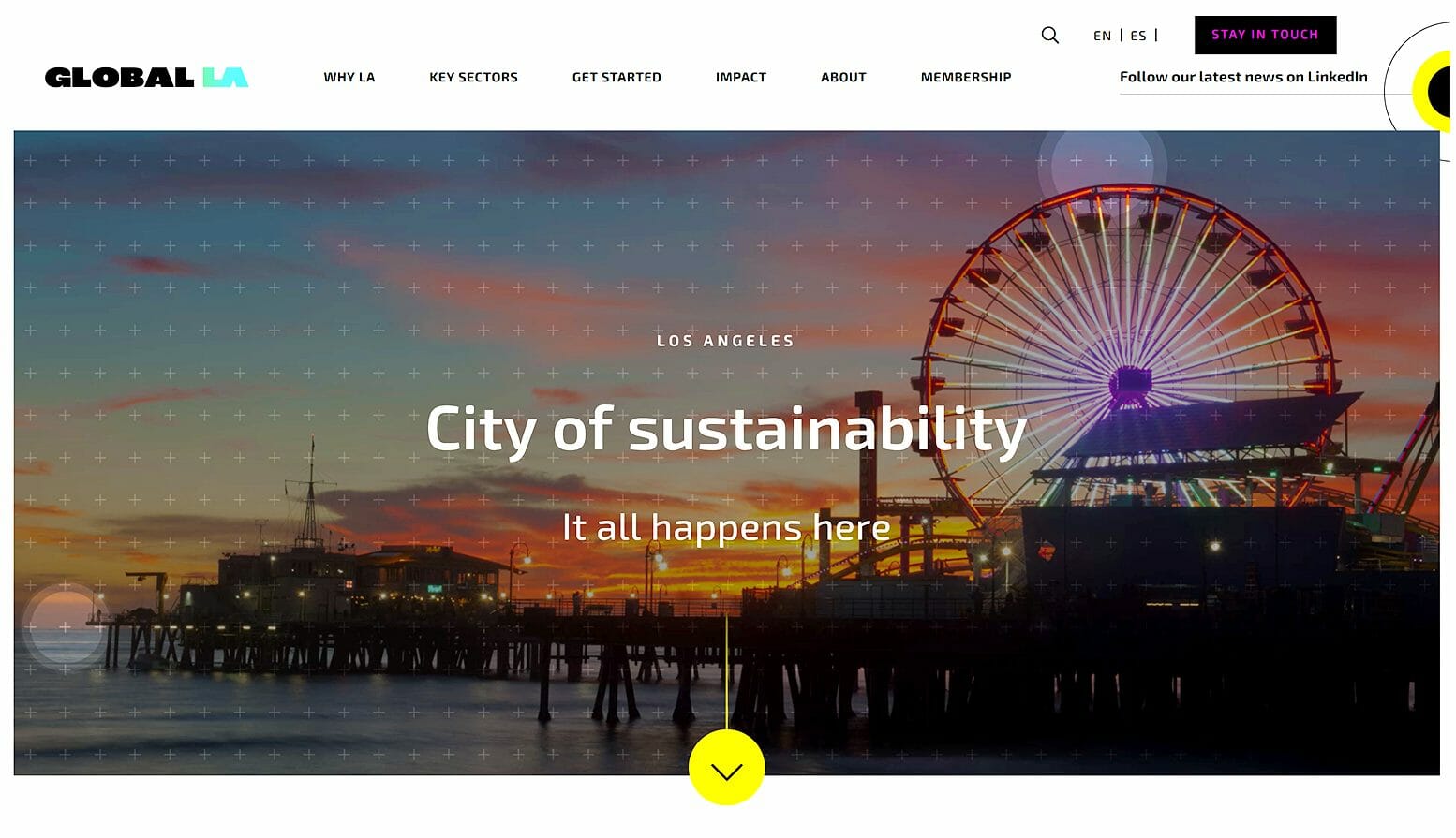
This is why it’s important for you to use photographs on your website. Photographs will draw the viewer in, conveying information without forcing him or her to read. This will make the website easier to use, and will, therefore, improve conversions.
Make sure that your photographs are relevant and that they’re of high quality. Irrelevant, low-quality photographs will do more harm than they will good.
Put These Web Design Ideas to Good Use
And there they are, 7 web design ideas to make your business website as effective as possible. Need help putting these ideas to good use? We here at Ripe Media are the people to see.
We’ve designed websites for countless businesses, helping them to attract traffic and convert customers. Our team can do the same for your business.
Contact us now to discuss your needs!


