14 May ‘18
Everyday Nonprofit Branding – It’s fun to stay at the YMCA
14 May ‘18
In: Branding & Visual Design, Case Study, Inspiration, Marketing, Nonprofit Resources, / By: Heather Richman
Instant Familiarity and Resonance
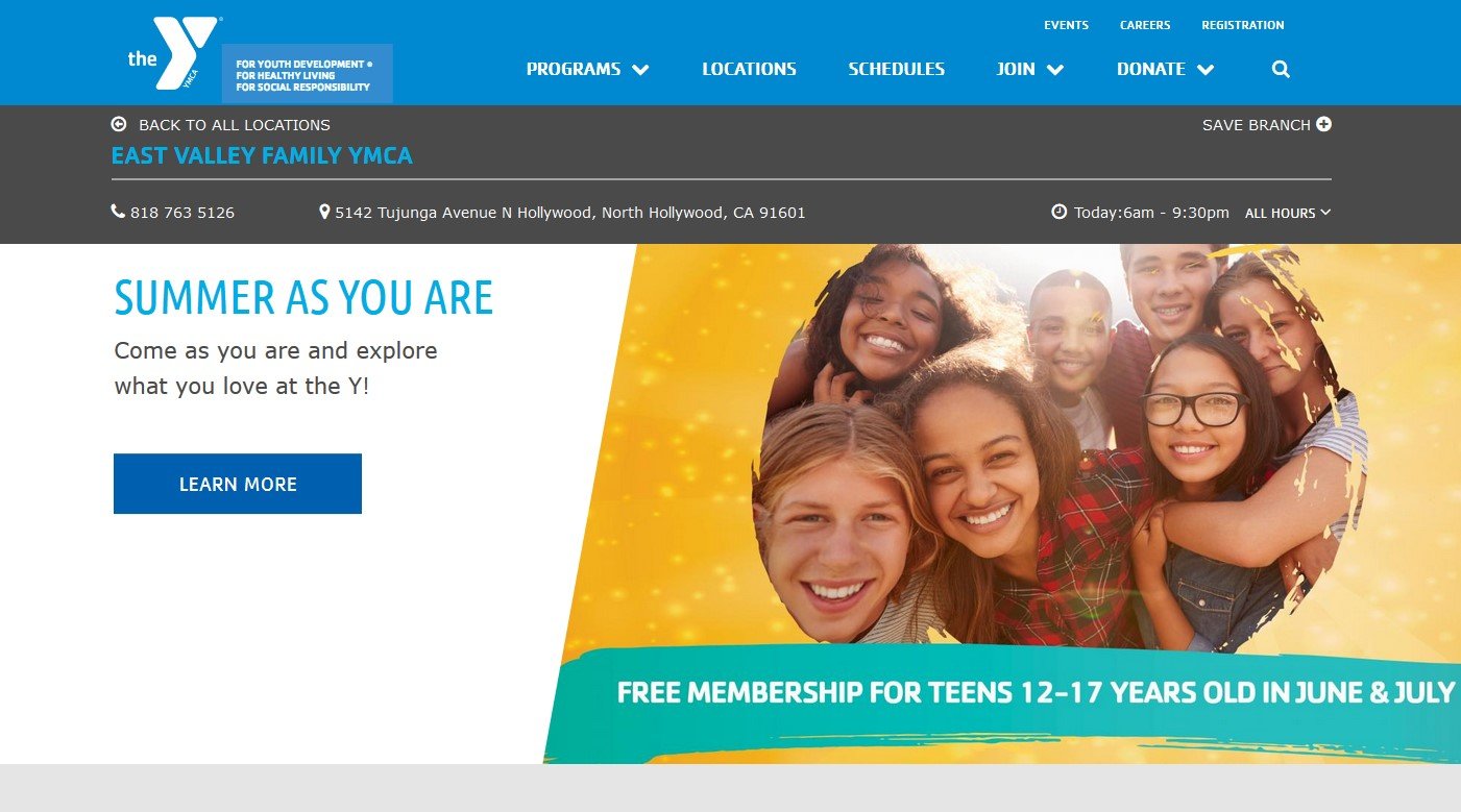
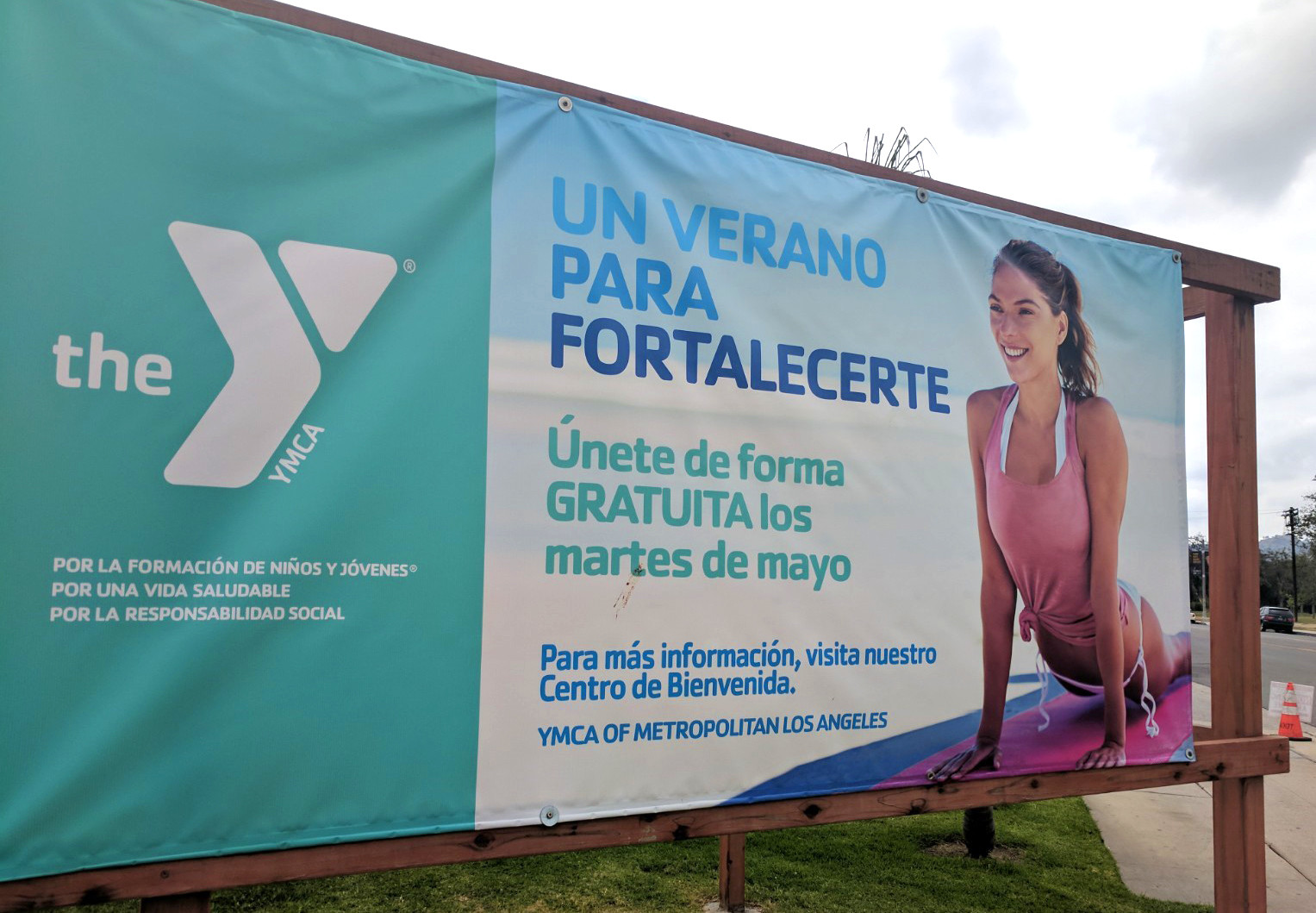
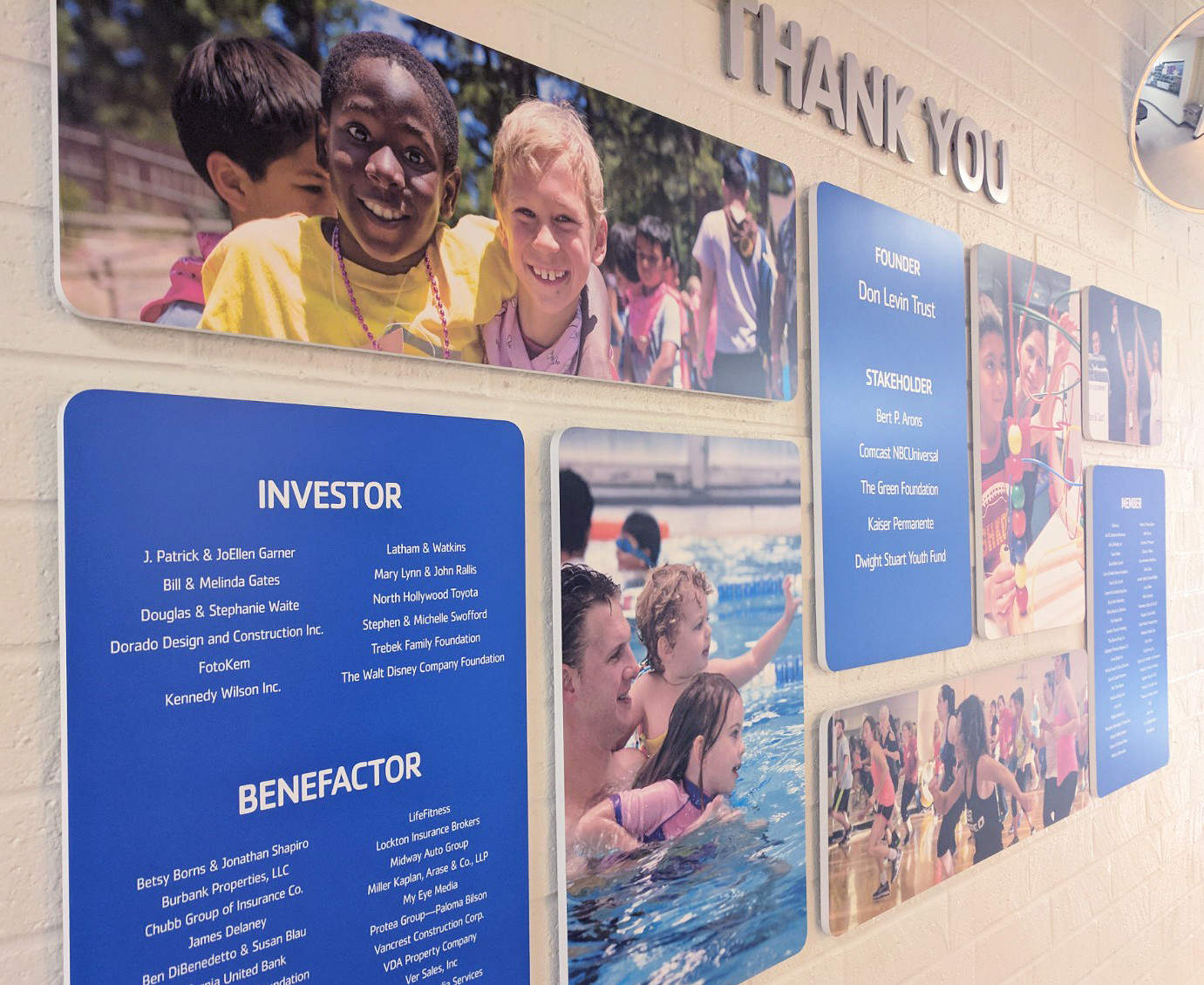
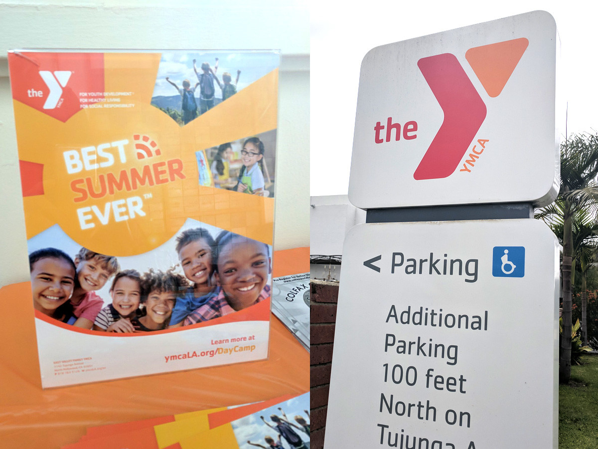
Upon arriving at the East Valley YMCA you’ll notice all the posters, signage, handouts and brochures, all of which are fine examples of nonprofit branding. And prior to that I used the website to signup Ruby to her Stage 3 Swimming Stamina class. Please see the sample materials below. All of them are of course cohesive which is sometimes half the battle with marketing and communications. So major props to the Y team for making that happen.
What stands out to me as most successful in the execution is how well it expresses a POV or brand strategy/identity. Whatever you want to call it, the Y is a perfect example of cause-based marketing that’s purposefully and smartly executed. Each piece speaks to the org’s most salient characteristics and its role in America’s communities. It’s apparent they did their homework and have successfully aligned their reason for existing with what their member’s value about them.
Customer Loyalty & Impact
Investing in well-done branding and effective marketing not only acquires new members, supporters and talent it also cultivates current customer loyalty. It’s not possible for every touchpoint to be optimal and in this case the Y’s materials enabled me to overlook aspects that attributed to a negative brand perception.
For example, the locker rooms are “icky” as Ruby noticed and this seems to be the case with most Y’s. Part of this is due to what people expect at their gym or workout centers, which isn’t 100% fair because that’s a commercial enterprise and the Y is a nonprofit community center. But that doesn’t alter people’s expectations.
And talk about less than perfect — this past weekend I experienced a less than positive situation with getting Ruby signed up for her next class. I was visibly unhappy with what happened and my daughter looked up and said “I’m sorry mommy that that happened.” It was so sweet and of course we survived but the experience left us feeling slighted. After a few deep breaths and an iced latte, we recovered and both of us determined that this poor customer experience was a result of an imperfect class registration process. But again I was able to overlook this glitch because this Y is an important community hub and as a parent I value all the positive aspects that my daughter has benefited from it. So we’ll try and re-reg in a few weeks. 🙂
All that to say major kudos to the Y team for mastering your nonprofit branding and marketing — it’s deep, challenging work and it never ends, but the payoff is remarkable and extends to the people you serve. Your brand is acting as your advocate so that you can advocate for others.
Cheers!
At an early age, Heather was fascinated by design and the effects of imagery on perception and emotion. Over time, these ponderings developed into creating art and studying printmaking, photography, and art history. For over fifteen years, she has built distinctive brand identities through print, web, and interactive work.
Heather is passionate about finding the right typeface, creating compelling designs, and wowing the client with her impeccable ability to visualize and verbalize a project’s goals. Her designs are like her laughs – irrefutable and infectious.


