11 Feb ‘15
UX Trends and Tombstones for 2015: Part 2
11 Feb ‘15
In: Business, Innovation, Mobile App Design & Development, Technology, User Experience Design, / By: Ripe Media
In Part 1, we wanted to take a little time explaining what the art and science of “UX Design” actually was. Next we’ll get into the nitty-gritty details, first with some trends that you’re probably well-aware of, that don’t show any signs of slowing down.

For yet another holiday season, every baby boomer who wanted a tablet got one. Another toddler started teething on the corners of an iPad and another college student wrapped up their senior thesis on a Surface Pro 3 with a stick-on keyboard.
This begs the question: is the PC dead?
The short answer is NO, clearly not, but it certainly is being tossed into the niche-o-verse very, very quickly. Think of it this way: once upon a time not too long ago, the desktop computer was all the rage. Everybody had a big, putty-colored tower on the floor, busily huffing dust into its jet engines so that you could keep typing away at AOL instant messenger. But the desktop PC isn’t dead – it simply fills a very specific niche; namely as a powerhouse for hardcore gamers, 3D graphic artists and others who need as much computing horsepower as possible for the money. The desktop also isn’t a bad idea for companies with cubicle farms that like to chain their employees to their desks (shame on you). The versatility of the tablet crosses age, lifestyle and activity boundaries; while the laptop is still a laptop. In short: the laptop will become a specialized niche product, like today’s ultra high-end performance desktop PC’s.
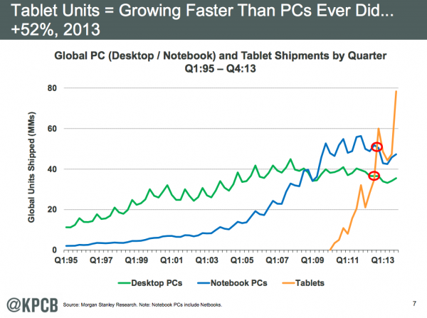
Not only have tablet sales already eclipsed PC sales, but PC sales are flatlining while tablet sales continue to skyrocket. What this tells us is that the laptop market is essentially saturated, while the tablet market is enjoying a period of novelty. The replacement-laptop market is not as energetic or enthusiastic as the first-time tablet market.
Let’s be honest, tablets don’t make us all that productive. Anyone who can touch-type will hate pecking out emails and documents on a tablet. With design, no finger can hope to give you the degree of precision that is capable with the old-fashioned pointer-and-mouse. But the tablet is a great casual-use, media consumption device, and casual-media-consumption isn’t going anywhere. The tablet can take the place of a personal e-reader, video streaming device, game console and oversized smartphone all-in-one.
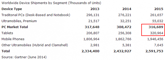
2014 marked the first year in history where tablet sales eclipsed the total PC market, that means that if you add up all of the desktop, laptop, ultrabook and all-in-one PC sales made in 2014, the number of tablets sold were greater than all of those products combined. From a UX perspective, the tablet is not as powerful as the laptop, but it is easier to use and more portable. This is probably the cornerstone of the tablet’s appeal, which hasn’t shown any sign of slowing down. The tablet bridges the gap between PC, phone, game system and TV. There is a very real possibility that the tablet will become even more ubiquitous than the television, as it gives the opportunity for every member of the household to have his or her own personal “television,” suited to his or her own unique tastes.
A mobile-friendly website is no longer optional
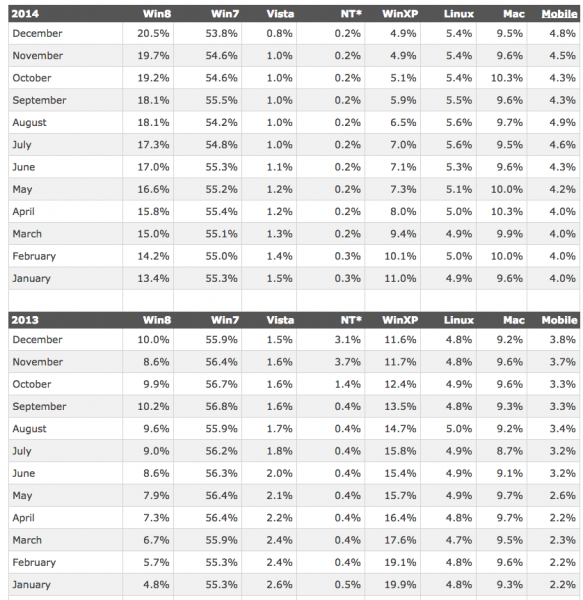
According to W3Schools.com, total mobile web usage more than doubled from 2013 to the end of 2014, from 2.2% to nearly 5% of total web traffic, that’s worldwide. The United States figure is closer to 30%, and other developed nations share a similar statistic.
(source: http://marketingland.com/mobile-traffic-now-28-percent-of-total-report-64218)
(Source: http://www.w3schools.com/browsers/browsers_os.asp)
First of all we have to be aware of the rate of growth, more than doubling in the period of a year shows that we can probably expect it to double again by this time next year. This includes ALL web traffic, including those of us that sit at work PC’s all day or your average sit-and-surf Starbucks squatter. The fact that mobile browsing is making such a dent in web usage is really quite amazing. Secondly, you have to configure the fact that mobile users are abandoning the mobile web for specific user-generated app-oriented tasks.
If you’ve written a blog article and elected to share it through Facebook and Twitter, there is good reason for you to suspect that 70-80% of your readers will see your social media post on a mobile app and attempt to read it on a mobile app. If you’re promoting content through social media, but the content that those links are pointing to aren’t presented in a mobile-friendly way, you’re going to have a slew of bounced visitors. Not only is that lost visitorship and lost revenue, it’s horrifically frustrating for your users. That’s bad UX!
I’ll share with you a personal example. I found out about a local event via the event’s Facebook page (where all local events find their home). As usual, the event promoters were eagerly posting updates, and were nice enough to provide a link where you could purchase links to the concert. I clicked the link from the Facebook app on my iPhone, and lo and behold, the resulting website was anything but mobile friendly. I had to pinch, scroll and zoom in order to find the ‘buy tickets with PayPal’ button. But what’s worse is that the PayPal button wasn’t coded to trigger my PayPal app to open so that I could complete the purchase on my phone.
We really have to look at the entirety of psychological events that occur when something like this happens. I was inconvenienced and so the spontaneity of my purchase was interrupted. I had my laptop nearby, so I went ahead and completed the purchase there – but how many other users would have forgotten about taking this extra step because they didn’t have their computer with them at the time? Lost opportunities are not always quantifiable. Simply because 5-30% of total web traffic is done on a mobile device, does not mean that your visitorship isn’t significantly higher, especially if you are publishing content to social media. Our point: having mobile-friendly web content is a must, its importance cannot be understated. A mobile-friendly website is no longer optional.
Apps are killing the mobile web
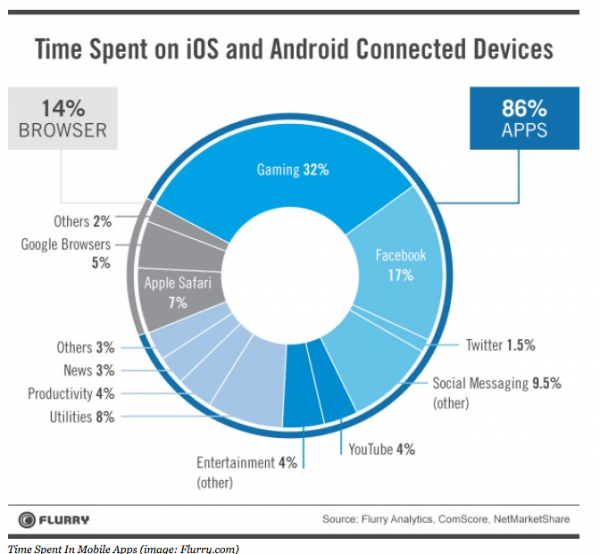
So I just got done telling you that mobile web browsing is quickly gaining ground on PC-web traffic and is highly likely to continue to do so. We have to be careful in how we look at statistics. If we’re looking at just web browsing, then yes, mobile web browsers are the fastest growing in terms of usage. However if we look at how people use their mobile phones, apps are way ahead of browser usage, 86% to 14%.
( Source: http://www.forbes.com/sites/ewanspence/2014/04/02/the-mobile-browser-is-dead-long-live-the-app/)
I’m sure you’ll agree that its a much more pleasant experience to check your email with your phone’s native mail app than it is to use the mobile web version of gmail or outlook. Why? Web browsers do one and one thing only: parse front-end code. Web-based applications are constrained to the limitations of the browser. But a native application, may it be for iOS, Android or anything else, can leverage the full processing and graphical capabilities native to that device. The experience will always be cleaner, faster, slicker and invariably feel more “at home” and integrated to the device’s OS and hardware.
The sad truth is that the “web” in general is becoming a niche in of itself – a vast encyclopedic compendium of human knowledge and our endless variety of tastes. Most of us are narrowing down on those specific repetitive tasks, for which we want a clean, fast and elegant solution. Apps fill this need in a much more efficient and effective way than any mobile website can. Take the act of ordering a pizza. You could: a) jump on google maps, then try to find a pizza place near you, then see if they have an online menu, then struggle to find one that allows for online ordering through your phone, or b) open the Grubhub app and flick through dozens of pizza parlors waiting to serve you.
The app already knows you, your billing information, your home address, and the one task that you want to use it for. It will what you want with a few swipes and a few taps – no typing or painstaking “searches” required. Thus, it was a very good move for Facebook to separate its messaging app from the main FB app. Facebook recognized that there is an inherent UX difference between the immediate and repetitive task of messaging your friends, versus the casual “checking and monitoring” of your Facebook feed. Facebook wanted your FB messenger to sit side-by-side with your all-important SMS app, and so it does. In the UX of apps from 2015 forward: lean, mean and focused will beat broad and multifaceted any day of the week.
Our closing point on apps: if you can make the case for having an app for your business, you should invest in having one produced. What the app should not be, is a miniature version of your entire website. If your website has one small, repetitive task, that is probably enough. Usually a news feed can be rolled into an app fairly easily. We have clients that have their own large job-listings page. This again is something that a mobile user might like to check on an app, perhaps with notifications built-in that can let the user new when a new job opening has been posted.
To be continued in Part 3!
Miss Part 1? Read it here!


